Grasping the Role of Visual Elements in Building a Brand Identity
Visual storytelling, driven by aesthetic brand elements, is the primary hero of successful brand recognition.
Just like a chef uses a recipe, your business employs a unique fusion of brand identity elements, such as color palette, typeface, design elements, and logo design, to whip up a delectable brand image.
This concoction sets the stage for your brand story and inspires potential customers to engage with your brand.
So, fasten your seatbelt and get ready to embark on a thrilling journey to discover the significance of visual elements in constructing a compelling brand image.
Invite curiosity and excitement to accompany you because we’re gearing up to explore the fascinating world of visual brand identities.
Key Takeaways
- Developing Brand Identity Is Like Creating a Pizza With Different Elements That Represent Your Brand’s Personality and Values
- Brand Identity Elements, Such as Logo, Color Palette, and Typeface, Play a Crucial Role in Shaping Brand Recognition and Image
- Web Design, Brand Style Guide, Marketing Materials, and Advertising Campaigns Are Important Components of Brand Identity
- Successful Brands Like Nike, Apple, Coca-Cola, and McDonald’s Have Effectively Used Visual Elements to Create Strong Brand Recognition
- Visual Brand Identity Should Evolve and Adapt Over Time to Stay Relevant and Resonate With the Target Audience
Defining Visual Elements in Brand Identity

Ready to start a trek on the path of brand identity creation? First, bookmark your business goals in the corners of your mind. You would want to pin the map on those as your destination points, metaphorically speaking.
Straight off the bat, realize this – developing your brand identity is like kneading dough into a delicious pizza. Brand identity elements are your ingredients; take one, the brand logo. A brand logo isn’t merely a batch of colors and design elements thrown together – it’s your brand’s visual ambassador, the face of your brand personality, standing tall at all your touchpoints.
Next on the ingredient list is the color palette and typeface. Much like the combination of your favorite pizza toppings, each color stands for a different facet of your brand values. Adding a unique typeface into the mix can be the perfect cheese stretch to your brand image. Now that we’ve given you a gist of these elements, let’s shape the entire process:
- Reflecting your brand story through your brand logo.
- Exemplifying brand values with a vibrant color palette.
- Enhancing brand image with a distinct typeface.
Web design, brand style guide, marketing materials, and advertising campaigns are the other slices of your brand identity pizza. To put it simply, your mission statement and brand guidelines fuel the branding process, while your brand value gets reflected off the sheen of your logo design.
This, in essence, is the appetizer to your brand strategy. Bon appetit! It’s time to cook up some unique brand recognition with these ingredients and serve your target audience a memory they can savor. Make sure to jot down these valuable takeaways!
After all, enticing social media posts, an engaging website design, and a captivating brand story are the garlic bread, salad, and pasta – the complete combo meal that complements your pizza! So, are your taste-buds tingling yet to create a tantalizing brand identity?
Now that we’ve dissected the essential components of visual elements in brand identity, gear up as we dive into its indispensable role. Buckle up and delve into why visual identity takes the center stage in successful branding.
Understanding the Importance of Visual Identity in Branding

Take a moment and picture branding as a bustling, busy orchestra. Each instrument holds its unique sound, yet they harmonize seamlessly to create a melodious symphony; similarly, individual brand elements blend harmoniously to shape an alluring brand identity. You, as the brand conductor, need to master the symphony of your brand’s visual identity.
Think of the brand logo as the vigorous strings section. Its tune defines your brand personality and resonates within the brand recognition of your target audience. The color palette and typeface play the role of woodwinds and brass: giving depth, tone, and texture to your brand image. The stage is set, and here is how your orchestra plays:
- The brand logo strikes the first chord, defining brand personality.
- The color palette and typeface add depth and texture, shaping the brand image.
- Other design elements play in harmony, strengthening brand recognition.
Remember, your brand identity is the music score that guides each instrument – it’s the conductor’s baton that unites them to play in concert. Thus, your website design, brand style guide, and the persona embodied in your marketing materials set the rhythm and harmony for your brand’s visual identity.
So, tune your brand strategy to resonate with your business goals and amplify your brand value. Your audience are locked in their seats, brimming with anticipation for your brand’s performance. Your mission statement is your opening note. Make it compelling; let it sing!
Learn to conduct your brand elements, fine-tune your brand identity design, and the symphony of your brand will arise more exuberant than ever before. Your ad campaigns, social media presence, and engaging brand story form the crescendo that wins standing ovations from your audience. The curtain falls, the applause echoes – you’ve mastered the symphony!
Having unraveled the paramountcy of visual identity in branding, it’s time for us to delve deeper. Buckle up as we plunge into the world of key visual elements that make successful brands stand out in the crowd!
Identifying Key Visual Elements in a Successful Brand

Let’s imagine you’re directing a blockbuster movie – your brand. Each of the brand identity elements plays a key role, like actors wearing different masks to portray different emotions. The pivot point? The screenplay: Your brand strategy.
Your logo design is the protagonist of your brand movie. It’s the character that draws the crowd and carries your brand value forth. The brand color palette and typeface are like the supporting actors, enhancing the brand image and enriching the storytelling. Now think: Who do you want to cast in your brandblockbuster? Here’s a shortlist:
- The logo design as the protagonist of your story.
- The supporting roles played by color palette and typeface.
- Other design elements as the ensemble in your cast.
Your marketing strategy, presumably the script, breathes life into your mission statement, while your brand guidelines add structure to the plot. Not to forget, your website design and social media presence— they stand as the sets and scenes where your story unfolds and content plays out.
Brand recognition is, in essence, the box office success of your movie. The applause after an epic climatic scene? That’s the impact of your advertising campaigns. Your target audience, entranced, leaves the theatre reeling in the ferocity of your brand story.
There you are, in the director’s chair, seeing your brand identity unfurl like a cinematic masterpiece. From the dramatic entrance to the intense climax — every scene, every act embellishes your brand identity design. Now, ready for the ‘lights, camera, action’ of your brand journey?
With a clear understanding of the significant visual elements that make a brand successful, it’s time to bring our discussion to life. Brace yourselves for some real-world applications, as we dive into case studies of some of the most successful visual brand identities in the market.
Case Studies: Successful Visual Brand Identity Examples
Okay, let’s gather the notes and take a field trip to the land of notable brands. Think about the brands that give you the ‘wow’ feeling with their visual elements. They’ve sailed through the same stormy seas to find their sunshine of brand recognition.
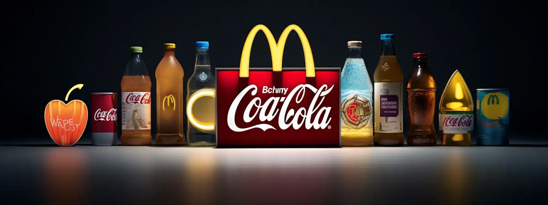
Nike, with its unmistakable swoosh and ‘Just Do It’ tagline, embodies a brand logo and mission statement with a punch. Concocted with their successful advertising campaigns and vibrant social media presence, it’s a tasteful example of how profound brand elements, mixed with a compelling brand story, can boost that contagious brand image. Casting light on other visual branding masterpieces, we can learn from:
- Apple: With a clean logo design to reflect simplicity and innovation.
- Coca-Cola: Their signature red color palette and unique typeface embody joy and nostalgia.
- McDonald’s: The iconic golden arches are recognized worldwide, symbolizing comfort and familiarity.
These brands’ strategies echo how they’ve creatively used the table of contents of the branding process, and indeed, successfully captured their target audience. Notice how their website design, style guide, brand personality reflect their unique business goals and personas, reverberating their brand value.
These examples, they are not just brands- they’ve left imprints of their brand assets on their audience’s minds, defining brand identity at its pinnacle. Every interaction, every touchpoint in these brands’ journey is a lesson in crafting full-bodied brand recognition.
Grab those magnifying glasses, and observe. With your newfound knowledge on the role of visual elements, it’s time to anticipate and breathe life into your brand identity elements. Who knows, tomorrow your brand might be a case study shining on the golden wall of brand identity success!
Having dived into the inspiring aspects of successful visual brand identities, let’s ignite our creativity and fashion our own compelling narratives. Strap in as we embark on a thrilling journey to create an effective visual brand identity, guaranteed to make your business stand out.
Creating an Effective Visual Brand Identity

Alright, as we’re sailing through the thick sea of branding, it’s time you pick up your artist’s palette. Paint your magical brand picture with a creative blend of universal logo design, vibrant color palette, and calculative typeface. Those are your primary colors, so let’s delve into the process.
Start by crafting your logo design – consider it as the lighthouse guiding your brand identity through the foggy nights of the market. Next up, choose a color palette and typeface that echoes your brand personality and story. These are your strokes of impressions, flourishes that carry forth your brand value. Let’s break it down into steps:
- Craft a distinct and impactful logo design.
- Select a color palette that reflects your brand story.
- Choose a typeface that amplifies your brand personality.
Tying up the elements in a brand style guide, and voila! You have the primary sketches of your brand identity design. However, an effective visual brand identity doesn’t stop here. It spirals out into your website design, marketing materials, advertising campaigns aligning with your overall brand strategies and business goals.
Sculpting an entrancing brand image involves immersing your touchpoints, such as social media presence, in your color palette, echoing your mission statement in your content. Your branding process is an artist’s journey that culminates in the masterpiece of brand recognition.
Creating a brand identity that’s worthy of a place in your target audience’s hearts is like painting a portrait. Each stroke, each shade, and each layer matter. So pick up that palette, and let’s paint the town with your brand colors!
Harnessing the power of an effective visual brand identity is just the initial step of this thrilling journey. Brace yourselves as we delve deeper into the captivating realm of evolving this identity over time, keeping your brand fresh, dynamic, and irresistible.
Evolving Your Visual Brand Identity Over Time

Bravo! You’ve scaled the peak of building your visual brand identity. But this ain’t the endgame, buddy. The market is like a carnival which is in a constant twist and turn, and your visual brand identity, like a skilled acrobat, must adapt and evolve over time.
Keep a keen eye out for changes; it’s like being locked in a dance with your customers. Shift your beats, move in rhythm with the music of their changing needs and social trends. The first rule? Never let your brand logo, color palette, or typeface grow stale in the eyes of your audience. Let’s take it step by step:
- Regularly assess your brand’s resonance with the audience.
- If necessary, spruce up your logo design or adjust your color palette.
- Adapt your brand style guide and all marketing materials to suit the evolved brand.
Remember how a chameleon changes its colors with its surroundings? Similar is your brand recognition; it should be resonating with intimacy and familiarity, while being fresh enough to captivate attention. To achieve this, your website design, social media presence, and advertising campaigns need to sway in sync with your evolving brand identity elements.
Engage and learn from your customers – they’re the song to your dance. Reflect their influence in your brand story, kiss it with a fresh typeface if needed. Showcase your adaptability as an asset, not a compromise – that’s the rhythm of brand recognition.
Building your brand image is like constructing a skyscraper; it doesn’t just reach towards the sky, it evolves with the changing skyline. So keep those dance shoes on and let’s sway to the ever-changing melody of the market!